
The split, and the reason behind it
The feature lists on both surfaces are close enough that comparing them tells you nothing. What differs is the hardware you are holding and the amount of information the screen can show at once, and those two things decide which tasks each is good at.
The phone wins where a camera, a fingerprint sensor or a push notification is the point. The desktop wins where you need to see several fields at once and check them against each other before pressing a button that cannot be undone. Almost every recommendation in this article follows from that sentence.
It is worth saying plainly that neither is more secure in the abstract. They fail differently. A browser is a large attack surface running extensions you have forgotten about; a phone is a single object that can be left in a taxi. Choosing per task rather than per preference is what actually reduces the risk.
Verification: the app, clearly
Identity verification is a photography task, and the phone is the better camera by a wide margin. It is also the better software: a native app controls exposure, focus, and which frames get uploaded, while a browser receives whatever the webcam produces and hopes.
We have not found a published source comparing the two routes, or any figure on success rates, so treat the camera argument above as a reason to try the app, not a measured difference.
If verification has failed twice in a browser, moving to the app is the highest-yield change available after fixing your lighting. The full sequence is in when verification keeps failing.
Orders and withdrawals: the web, clearly
Anywhere you type a number that determines how much money moves, the desktop is safer, for reasons that are entirely about screen area and input precision.
- A withdrawal has at least four fields that must all be right — network, address, memo, amount — and the desktop can display all of them simultaneously alongside the fee and the amount actually arriving. On a phone you scroll, and scrolling means checking fields from memory.
- Decimal points. A mistyped order size is obvious on a wide screen with a full keyboard and easy to miss on a phone. The interfaces are not at fault; thumbs are less precise than fingers on keys.
- Address verification. Comparing the middle of a long string against a saved entry is realistic on a desktop and genuinely hard on a phone, which is where the habit of only checking the first and last few characters comes from.
- Security settings. Whitelists, API keys and device management are dense screens with consequences, and dense screens are what desktops are for.
The honest version of this section: the app can do all of these. The question is not capability, it is how likely you are to catch your own mistake before confirming, and that is a function of how much you can see at once.
The things only the app does
Push notifications are the real one, and they are a security feature rather than a convenience. A login from a new device, a withdrawal request, a changed setting — the value is in finding out within seconds rather than at the next time you happen to log in. Nothing on the web replicates that, because a browser you have closed cannot tell you anything.
Beyond that: biometric unlock, camera-based document capture, QR scanning for addresses and for pairing devices, and generally a better experience for quick checks such as glancing at a balance.
If you keep any meaningful balance on an exchange, having the app installed with notifications enabled is worth doing even if you never place an order from it.
The things that are easier on the web
Less discussed, and it matters at the moments when you need it.
- Exporting history. Trade, deposit, withdrawal and funding exports are built for a desktop and awkward or absent on mobile. When you need to reconcile a position or file something for tax, this is where you will be.
- API key management. Creating a key, setting its permissions and binding it to an address is a task with consequences and it belongs on a large screen.
- Sub-account administration and anything involving multiple accounts at once.
- Reading the terms, the fee schedule and the rules pages. These are long documents with tables. They are technically readable on a phone and nobody reads them there.
Different surfaces, different attacks
What goes wrong in a browser
- The wrong site. A search advertisement, a bookmark saved from a phishing link, a lookalike domain. The browser will happily render a perfect copy of the login page. Type the domain yourself or use a bookmark you created from a verified session.
- Extensions. Anything with permission to read page content can read your account. Extensions also change hands, and a well-behaved tool can become something else in an update.
- Clipboard interference. Malware that swaps a copied address for its own, chosen to have similar first and last characters — which defeats a check that only compares the ends of the address.
- Shared and public machines. Not worth the risk for anything financial, at any time, for any reason.
What goes wrong on a phone
- Fake applications. Installed from an advertisement or a third-party store, visually identical, and harvesting credentials from the first screen.
- Losing the device while it also holds the authenticator, the email account used for recovery, and the SIM that receives the codes. One object, every factor.
- SIM swap. If SMS is your second factor, control of your phone number is control of your account, and phone numbers are transferred by a customer-service process rather than by cryptography.
- Shoulder surfing in public, which sounds trivial until it is the moment you type a code.
Where you get the app from
Only from the official store listing reached through the platform's own website, or from the download page on that website. Not from an advertisement, not from a link in a message, not from a third-party APK site, and not from a search result you did not verify.
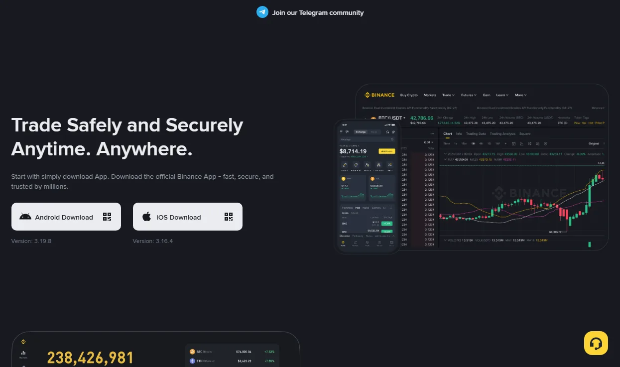
One consequence of the separate version numbers: when a walkthrough written elsewhere does not match what you see, check which platform and which version it was describing before concluding that something is wrong with your account.
Where your second factor lives
This is the part of the app-versus-web question that actually determines outcomes, and it is usually left out because it does not fit the comparison-table format.
If the exchange app, the authenticator app, the email account used for recovery and the SIM that receives codes are all on the same phone, then that phone is a single point of failure for everything. Losing it is not an inconvenience; it is losing every factor at once, and the recovery process that follows is the slowest one the platform offers.
Two arrangements that fix it without much effort: keep the authenticator's recovery codes written down and stored offline, and make sure at least one of your factors lives somewhere other than the phone — a second device, or a hardware key. The details of what to enable and in what order are in account security.
A setup that uses both properly
- Install the app and turn notifications on. Its most valuable function is telling you about things you did not do.
- Do identity verification on the app. Better camera, better capture code, fewer retries.
- Do withdrawals and security settings on the desktop. More fields visible at once means more chances to catch yourself.
- Set up a withdrawal address whitelist from the desktop, then use it from either surface. Selecting a saved entry beats pasting an address on any screen size.
- Keep at least one authentication factor off the phone. Otherwise the convenience of having everything in one place is also the failure mode.
- Bookmark the real domain from a session you know is genuine, and reach the site only through that bookmark.
Quick answers
Is the app less secure than the web version?
No, and the framing is the problem. They are exposed to different attacks. A phone is harder to compromise remotely and easier to lose physically; a browser is the reverse. Use each for the tasks its failure mode does not threaten.
Why does the app show a feature the website does not, or the reverse?
Because they ship separately, on separate version numbers, and features arrive on one platform before the other. It is not a sign that anything is wrong with your account.
Is it safe to stay logged in on the app?
Safer than staying logged in on a shared browser, provided the phone has a lock and biometric unlock is enabled for the app. Set the session timeout as short as you can tolerate, and review active devices periodically.